Visualizing Data with Charts and Maps
Last updated on 2025-06-05 | Edit this page
Estimated time: 50 minutes
Overview
Questions
- How do I create a line chart, histogram, or map in Tableau?
- How do field types affect the kind of visualization Tableau creates?
- How can I use geographic data for mapping?
Objectives
- Create a line chart showing accidents over time by area.
- Use binned time data to generate a histogram.
- Create a basic map using latitude and longitude values.
Welcome back! In this episode, we will take the data we’ve prepared and start building impactful visualizations. We’ll explore how to create common chart types, such as line charts and histograms, and delve into the exciting world of mapping with geographic data.
Line Chart: Accidents Over Time by Area
To start, let’s visualize how the number of accidents changes over time, broken down by different areas. When thinking about a “time series” chart, we typically want time on our horizontal (x) axis. Let’s examine our available time variables.
Accidents over time
- Open a new worksheet. Let’s rename this sheet
Accidents Over Time. - Drag
Date Occurredto Columns. You’ll notice it likely appears as a blue pill (discrete year). -
Important: Right-click
Date Occurredon the Columns shelf → Convert to Continuous (chooseYearunder the green “Continuous” section). This transforms it into a green pill, representing a continuous timeline. - Drag your calculated field,
Number of Accidents, to Rows. - To see trends for different areas, drag
Area Nameto Color under the Marks card. This will create a separate line for each area and generate a color legend. - Double-click axis labels to rename them if desired, for example, from “SUM(Number of Accidents)” to “Number of Accidents.”
Understanding Continuous vs. Discrete Dates
When you first drag a date field, Tableau often defaults to a “blue pill” (discrete), showing individual years as distinct categories. However, for visualizing trends over time along a continuous axis, a “green pill” (continuous) is essential. This creates a proper timeline, allowing for smooth lines and animations, which we’ll explore later!
Histogram: Accidents by Time of Day
Use the binned field created in the previous episode to examine accident frequency over time.
- Create a new worksheet.
- Drag
Time Occurred (bin)to Columns. - Drag the calculated field
Number of Accidentsto Rows.
- Optional: Drag
Area Nameto Filters, then click the filter card menu → Show Filter.
Histograms are ideal for showing the distribution of values across intervals—perfect for analyzing “Time Occurred.”
Bar Chart: Accidents by Age
Next, let’s visualize how accident counts vary by the age of the victim. This will help us understand the distribution of accidents across different age groups.
Accidents by Age
- Create a new worksheet and rename it
Age Distribution of Accidents. - Drag
Victim Ageto Columns. - Right-click on
Victim Ageon the Columns shelf and choose Convert to Dimension. (Even though age is a number, we’re treating it as a distinct category for each bar in this chart, rather than a continuous range for a single line.) - Drag
Number of Accidents(your calculated field) to Rows. - Change the Marks type from Automatic to Bar.
- Use the Size slider on the Marks card to reduce bar width and prevent overlap, making the bars easier to distinguish.
- Go to Analysis > Show Mark Labels to display the
Number of Accidentsdirectly on top of each bar.
Interpreting the Age Distribution
Now, let’s look at this distribution. Notice any interesting patterns? You might observe peaks at specific ages (like 30, 35, 40, 45). This has come up before in workshops, and it’s quite interesting! It often makes us wonder if, for example, the LAPD estimates or rounds ages to the nearest five-year mark when exact victim age is unknown.
Also, look at the very high bar around age 99. Why might there be so many victims listed at age 99? While we don’t have explicit documentation, a common practice in data collection is to use “99” as a placeholder for an unknown age. This is a great example of how visualizing data can reveal unexpected trends and prompt deeper questions about data collection practices!
Interpret the Distribution
- Do any ages have unusual spikes?
- What might cause them?
Consider estimation or rounding practices in field data collection.
Map: Plotting Accidents in Los Angeles
Now for one of Tableau’s most powerful features: creating maps! If
your dataset includes a Location column like
"34.05, -118.24", Tableau can help you visualize these
geographic points.
Mapping Accidents in Los Angeles
- Open a new worksheet and rename it
Accident Map. Right-clickLocation→ Split. This will separate the latitude and longitude values based on the comma. - Rename the resulting fields
Location Split 1toLatitudeandLocation Split 2toLongitude. - Right-click each field in the Data pane → set Data Type to Number (decimal).
- Right-click again → set Geographic Role: for your
Latitudefield, chooseLatitude; for yourLongitudefield, chooseLongitude. (You’ll see a small globe icon next to them once set correctly.) - Double-click both
LatitudeandLongitudefields. Tableau will automatically place them on the Rows and Columns shelves, respectively, and start rendering a map. - Once the map begins to load, use the map search bar (magnifying glass icon in the top right of the map view) to zoom directly to Los Angeles.
Map Loading & Interaction Tips
Maps, especially with many data points, can sometimes take a moment to load. Be patient! Once loaded, you might find yourself zoomed out to a global view. Use the search bar to pinpoint “Los Angeles, California” and quickly zoom in.
Each point now represents a traffic incident. You can click the Pan Tool (represented by a hand icon) on the map controls to navigate the map view easily.
Each point now represents a traffic incident.
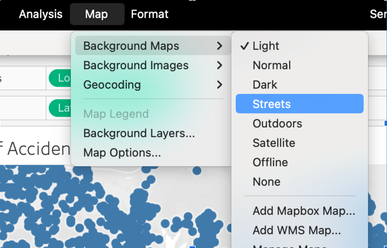
Optional: Refine Your Map Display
To improve readability and orientation:
- Go to Map → Background Maps → Streets to switch to a street-level basemap.
- Use the Pan Tool (click the hand icon) to move across the map.
- Remove null points by right-clicking on any point in the ocean (0,0) and selecting Exclude.
Challenge
Challenge: Compare Accidents Across Areas
Create a bar chart showing how accident counts compare across different police areas.
- Which field will you put on the x-axis (Columns)?
- Which field is best for the y-axis (Rows)?
- Can you improve the chart by adding
Color,Label, or aFilter?
Use Area Name for Columns and
Number of Accidents as the Measure.
- Drag
Area Nameto Columns. - Use
Number of Accidents(COUNT ofDR Number) on Rows. - Optionally add
Number of Accidentsto Label for better readability.
- Dragging fields to Columns and Rows defines the structure of your chart.
- The Show Me panel helps you quickly preview different visualization types.
- Latitude and longitude values can be transformed into map views using geographic roles.