Exploring and Cleaning Your Data
Last updated on 2025-06-05 | Edit this page
Estimated time: 40 minutes
Overview
Questions
- How does Tableau interpret and categorize data types?
- What are Dimensions and Measures?
- How do I identify and prepare fields for visualization?
Objectives
- Understand Tableau’s automatic data typing (dimensions vs. measures).
- Explore the Show Me panel to preview visualization options.
- Use calculated fields and binning to prepare data for charts.
Dimensions and Measures
After loading your dataset and opening a worksheet, you’ll notice that Tableau classifies your columns as either:
- Dimensions (blue): qualitative data like names, IDs, or categories.
- Measures (green): quantitative data that can be aggregated, such as counts or amounts.
Tip:
You can change a field’s classification by right-clicking and selecting Convert to Dimension or Convert to Measure.
Discrete vs. Continuous
Tableau also distinguishes between:
- Discrete fields: Separate values like city names, months, or categories. These usually appear as blue pills.
- Continuous fields: Numeric or time-based fields used on a continuous scale. These usually appear as green pills.
Pro-Tip: Blue vs. Green
In Tableau, colors are key! - Blue pills (discrete) mean you’re looking at distinct categories or individual items. - Green pills (continuous) mean you’re viewing data along a continuous axis, like a range of numbers or a timeline.
Sometimes, Tableau might interpret a date field as discrete (blue), showing individual years as distinct categories. However, for analyzing trends over time, we often prefer a continuous (green) date field so it acts like a proper time axis. You’ll see us change this later to ensure smooth visualizations.
Exploring the Data with Show Me
The Show Me panel suggests visualizations based on the fields you’ve selected.
Try this:
- Select
Area NameandDR Number - Click on different chart types in the Show Me panel
- See how Tableau updates the chart preview dynamically
Creating a Calculated Field
You can create new fields to better control your visualizations. A calculated field allows you to perform calculations or transformations on existing data to create new insights.
To count the number of traffic accidents:
- Right-click in the Data pane → Create Calculated Field
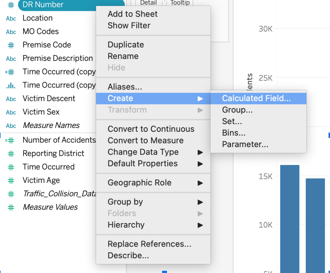
- Name it:
Number of Accidents - Formula:
COUNT([DR Number])
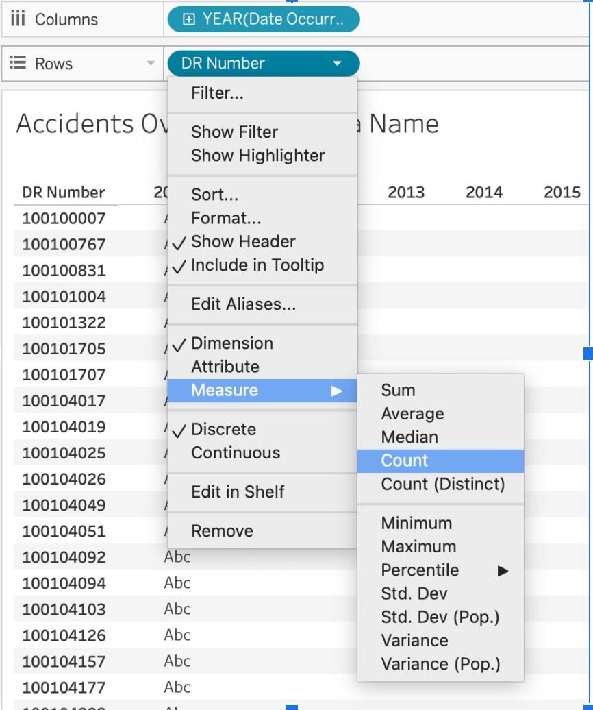
This new measure will appear in your data pane. You might notice it’s
a green with a little = sign next to it.
Can you guess why Tableau interprets Number of Accidents as
a continuous measure? (Pause for thought) It’s
green because it’s quantitative (a number of accidents), and it’s a
measure because it’s an aggregated count.
Troubleshooting Tip: Freezing Tableau
If Tableau freezes while you’re working, it can be frustrating! Try saving frequently. Also, a good practice before experimenting with complex changes is to duplicate worksheets. To duplicate: right-click on the sheet tab → Duplicate. This ensures you have a stable version to revert to.
Creating Bins (for Time of Day)
To examine accident frequency across different times of day, creating bins allows you to group continuous data into discrete intervals. This is particularly useful for building histograms or charts that show distributions.
- Right-click on
Time Occurred→ Duplicate - Right-click the duplicate → Convert to Dimension (This is important because we want to treat hours as distinct categories for grouping, not a continuous stream.)
- Right-click again → Create Bins
- Set bin size to
100(This effectively groups by hour, asTime Occurredmight be in a HHMM format.)
This creates a new field like Time Occurred (bin) that
groups records by hour.
Practicing with Tableau
- Use Show Me to try 3 different chart types with
Area Name,Date Occurred, andDR Number. - Create a calculated field to count accidents.
- Create a binned version of
Time Occurred. - Which fields would be good candidates for filters in a dashboard?
Data Exploration & Preparation
Think about what each field represents and how it might be grouped or summarized. Clean, consistent values (like standardized department names) make visualizations more readable and accurate. Remember, the goal of cleaning and exploring data is to make it ready for clear, effective communication through visualizations.
- Tableau automatically classifies data into dimensions (categorical) and measures (quantitative).
- The “Show Me” panel suggests visualization types based on selected data.
- Data preparation, including binning and calculated fields, improves visualization clarity.